PC Algorithm: Example using real data
To illustrate how to work with the PC algorithm on real data instead of synthetic test data, we are going to look at the Retention data set containing information on college graduation that was used in the article "What Do College Ranking Data Tell Us About Student Retention?" by Drudzel and Glymour (disclaimer: the idea to use this data set was taken from the causal-cmd homepage, which readers of this documentation are strongly encouraged to look at!).
The can be loaded into a dataframe in a few lines of code:
using HTTP, CSV, DataFrames
using CausalInference
using TikzGraphs
# If you have problems with TikzGraphs.jl,
# try alternatively plotting backend GraphRecipes.jl + Plots.jl
# and corresponding plotting function `plot_pc_graph_recipes`

url = "https://www.ccd.pitt.edu//wp-content/uploads/files/Retention.txt"

df = DataFrame(CSV.File(HTTP.get(url).body))

# for now, pcalg and fcialg only accepts Float variables...
# this should change soon hopefully
for name in names(df)
	df[!, name] = convert(Array{Float64,1}, df[!,name])
end

# make variable names a bit easier to read
variables = map(x->replace(x,"_"=>" "), names(df))
This dataframe can be used as input to the PC algorithm just like the dataframes holding synthetic data before:
plot_pc_graph_tikz(pcalg(df, 0.025, gausscitest), variables)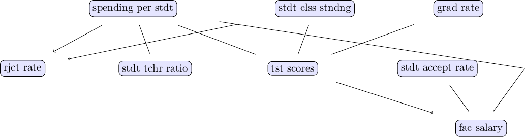
At first glance, the output of the PC algorithm looks sensible and appears to provide some first insight into the data we are working with. In particular, the causal factors influencing faculty pay appear rather sensible. However, before drawing any further conclusions, different versions of the PC algorithm (e.g., different p-values, different independence tests, etc.) should be explored.